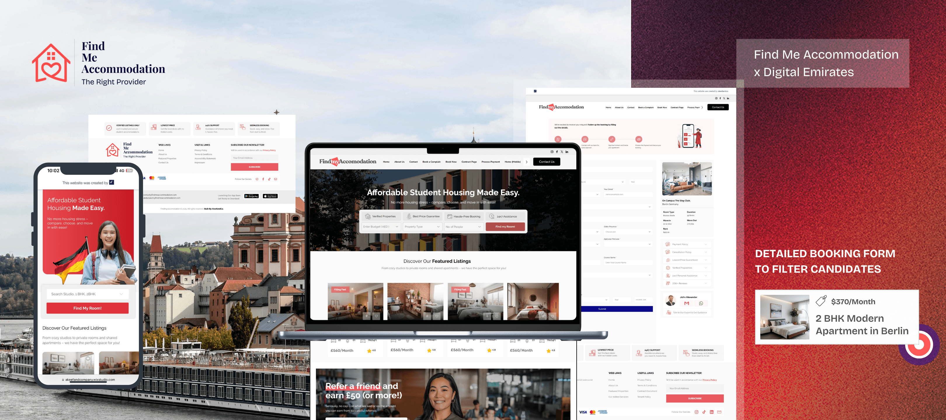
Creating a Clear, User-Friendly Accommodation Search Platform for Find Me Accommodation
Case Study
Introduction
In the competitive world of travel and property search platforms, clarity and usability are critical. Users seeking accommodation want fast, reliable information without friction — and a website must be designed to deliver exactly that.
When Find Me Accommodation came to Digital Emirates, they had an idea rooted in simplicity: deliver a platform where travelers can search, compare, and book accommodation effortlessly. What they needed was a structure that transforms their concept into a powerful digital experience that is intuitive, scalable, and user-centric.
This project was not just about design; it was about translating complexity into simplicity without compromising functionality.
Client Overview
Find Me Accommodation operates as an online search and comparison platform focused on helping travelers find accommodation options around the world. Users can search listings, compare properties, and make informed decisions about where to stay.
The goal was to provide a seamless experience for users whether they were searching for short stays, long stays, or comparing multiple properties side-by-side. At the same time, the platform needed to be accessible and intuitive for a diverse audience from different travel backgrounds.
Challenges Faced
Before working with us, the site faced several challenges:
User experience inconsistency: Visitors struggled to quickly find and compare listings.
Lack of clear comparison tools: The property comparison feature was functional but lacked intuitive flow, reducing engagement.
Unstructured information hierarchy: Pages contained useful content, but it wasn’t presented in a way that clearly guided users from search to decision.
Limited brand identity: The existing visuals and layout didn’t fully reinforce the brand’s value or user trust.
The challenge was not the idea — it was structuring it for clear user decision-making.
Our Strategy & Approach
Our work began with a critical foundation: user-centered information architecture. We asked, “How can we reduce effort for the user while increasing clarity and trust?”
1. Refined Search Experience
We redesigned the property search flow so users could immediately filter, sort, and compare listings with fewer steps. Efficiency became a priority.
2. Streamlined Comparison Features
The property comparison feature was transformed into a clear, side-by-side view that works responsively across devices, helping users make decisions faster.
3. Logical Content Structure
Instead of overwhelming pages with blocks of content, we redesigned sections around user goals like “Find,” “Compare,” and “Decide,” making navigation more intuitive.
4. Brand-Aligned Visual Enhancements
Visual elements were refined to improve readability, hierarchy, and trust — all while keeping performance and simplicity in focus.
Execution & Key Deliverables
We delivered a cohesive and strategic platform that included:
A user-optimized search interface
A responsive property comparison tool
Clear call-to-action design for booking or inquiry
Reorganized content that reflects user intent
UX improvements that support faster decision-making
Each element was designed not only for usability but also to strengthen users’ trust in the platform and reinforce the brand experience.
Results & Impact
With the new platform in place, the impact was evident:
Improved user engagement through simplified search and comparison workflows
Higher clarity in property exploration, reducing drop-offs
Stronger trust signals throughout the website experience
A digital platform that serves users with intent and efficiency
Users now have a structured pathway from browsing to booking, which translates into higher satisfaction and deeper engagement.
Why This Project Stands Out
What makes this project premium is not the features alone — it’s the strategic alignment between user needs and business goals. We didn’t just make the site look better. We connected the dots between:
User intent
Clarity of information
Effortless interaction
Seamless comparison and decision flow
This alignment is what makes digital platforms succeed in competitive spaces where travelers have countless alternatives. Strategy first, design second — that’s the approach that creates lasting impact.
Conclusion
Great digital experiences start with understanding — not assumptions.
For Find Me Accommodation, our work delivered a platform that speaks directly to users, guides them effortlessly, and supports the brand promise of finding the right place to stay with ease.
At Digital Emirates, we design with purpose — ensuring technology, content, and strategy work together to solve real user and business challenges.
If you’re ready to build a digital experience that performs with clarity and purpose, we’d be glad to help.